

Выбирайте со вкусом
Каталог продукцииДавайте знакомиться
О компанииКак мы это делаем
О производствеПокупайте с легкостью
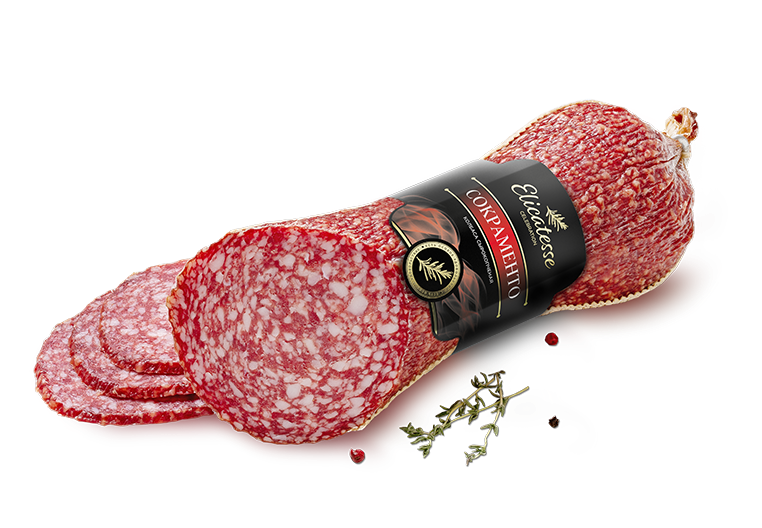
Маркетплейсы 12 продуктов в категории
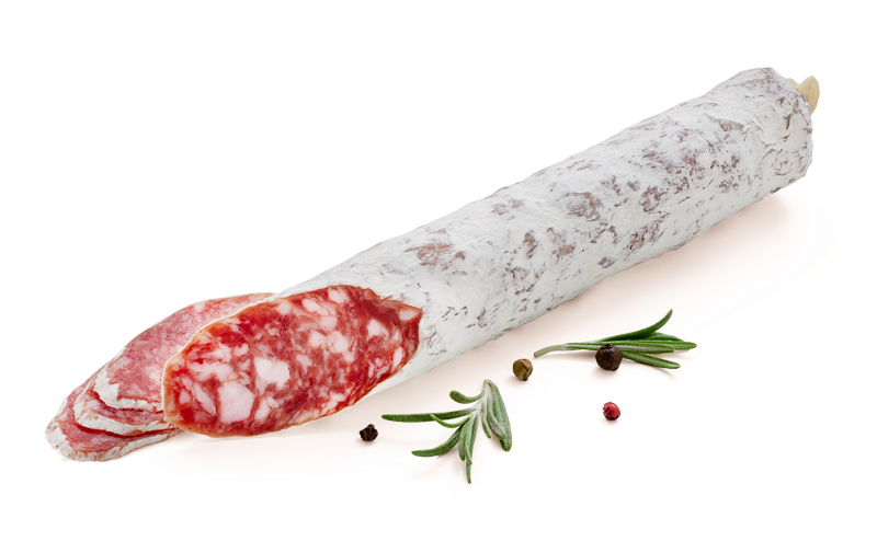
 22 продукта в категории
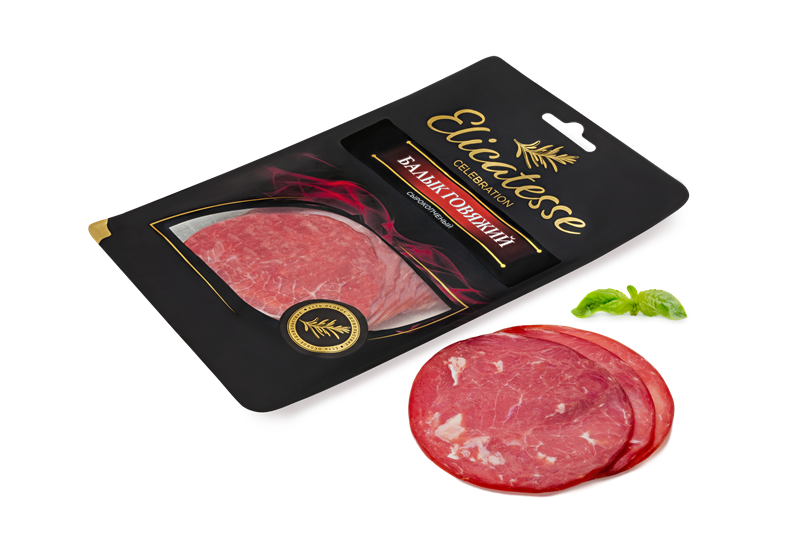
 21 продукт в категории
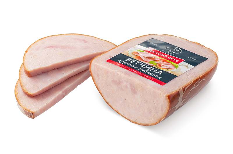
 7 продуктов в категории
 17 продуктов в категории
 10 продуктов в категории
 7 продуктов в категории
 4 продукта в категории
 4 продукта в категории
 9 продуктов в категории
 13 продуктов в категории
 5 продуктов в категории
 6 продуктов в категории
 19 продуктов в категории
The axis of the curved letters (like the lowercase 'o' or 'c') is perfectly vertical. This contributes to a sense of stability and formality. Unlike old-style fonts which have a diagonal stress mimicking the hand-held pen, Verona FS looks industrial and structured. This gives the text a grounded, authoritative voice.
The axis of the curved letters (like the lowercase 'o' or 'c') is perfectly vertical. This contributes to a sense of stability and formality. Unlike old-style fonts which have a diagonal stress mimicking the hand-held pen, Verona FS looks industrial and structured. This gives the text a grounded, authoritative voice.
 Поиск по сайту
 Напишите нам
 Подписаться